
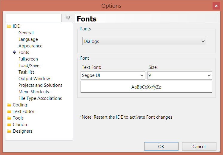
In Clarion 9.1 and 10 you can change the fonts for the IDE. This makes it easy to customize the IDE to look the way you want it to. Personally I change the environment fonts to Segoe UI 9pt for dialogs and listboxes and Segoe UI 17pt for the Start page.
I use good, old, boring Courier New 10pt for the editor but you might want to try Consolas, Lucinda Console or some other fonts. Somehow I have ended up with one of Adobe's font on my laptop, "Source Code Pro" which comes in several different versions (black, semi-bold, light, extra-light) The normal one looks pretty good, but I haven't really used it. I have also used Droid Sans Mono which is a Google font. If you want to find fonts to use in your editor, something other than Courier New, then go to fontsquirrel and have a look around.
Note that you must restart the IDE for the font changes to show. This applies to all the font settings, also the Text Editor settings, which is a bit of a bother as you have to restart the IDE just to see how the fonts look like. My suggestion is to load some code into WordPad and use it to pick a font that looks good to you and start from there. WordPad has a nice feature where it will automatically reformat the text when you hover over a font in the font selection drop-down so it's easy to see how the font will affect the code. See the video below for a demonstration.
Hope this will help you set up your environment to your liking:)
Update: Here is an article, while from 2010, contains a nice collection of monospaced programming fonts:
http://www.codeproject.com/Articles/30040/Font-Survey-of-the-Best-Monospaced-Programming
Arnor Baldvinsson
![]()